Motivation
If you read scientific papers or you spend a significant amount of time around data you may have come across a Q-Q plot. Before this investigation I never really knew what I was supposed to take away from a Q-Q plot. In this post I’m going to “dissect” a few examples and explain what certain features of a Q-Q plot should indicate. You can find the code to reproduce the graphs in this post here.
What is a Q-Q plot?
Both Qs stand for “quantile.” A quantile is a slice of a dataset such that each slice contains the same amount of data. Imagine you have a sorted dataset of integers. If you specify that your dataset has two quantiles, then the first 50% of your dataset is in the first quantile (all of the integers from the minimum integer to the median integer) and then the last 50% of your dataset is in the second quantile (all of the integers from the median integer to the maximum integer). You may be more familiar with percentiles, in which case you’re slicing a dataset into 100 parts of equal size. If you’ve ever taken a region-wide exam you may have read in your results that “you scored in the 87th percentile,” meaning that you earned a higher score than 87% of test takers.
A Q-Q plot compares the quantiles of a dataset and a set of theoretical quantiles from a probability distribution. Therefore a Q-Q plot is trying to answer the question: “How similar are the quantiles in my dataset compared to what the quantiles of my dataset would be if my dataset followed a theoretical probability distribution?” The theoretical distribution in the following examples is the Gaussian (Normal) distribution with mean 0 and standard deviation 1.
In a Q-Q plot each data point in your dataset is put in its own quantile, then a data point is generated from the corresponding theoretical quantile. These two points are plotted against each other. Let’s look at some actual Q-Q plots so you can see what I mean.
Actual Plots!
Plot 1: Situation Normal
Below is the first plot we’ll be dissecting and the code that drew the plots.
# Draw two plots next to each other
par(mfrow = c(1, 2))

# normal_density are the y-values for the normal curve
# zs are the x-values for the normal curve
n <- 1000
normal_density <- dnorm(seq(-4, 4, 0.01))
zs <- seq(-4, 4, 0.01)

# Add some spice to the default histogram function
hist_ <- function(x, ...){
  hist(x, breaks = 30, xlab = "Z", ylab = "",  yaxt='n', freq = FALSE, ...)
  lines(zs, normal_density, type = "l", col = "red", lwd = 2)
}

# Gaussian Normal
# rnorm() generates random numbers from a normal distribution
# gaussian_rv is the dataset that will be compared to the Gaussian distribution
gaussian_rv <- rnorm(n)

# Draw the histogram
hist_(gaussian_rv, main = "Gaussian Distribution")

# Draw the Q-Q plot
qqnorm(gaussian_rv)
qqline(gaussian_rv, col = "blue", lwd = 2)
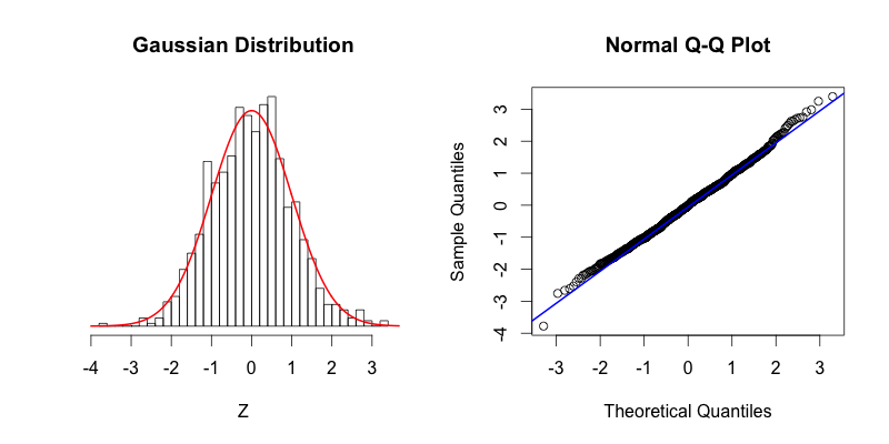
On the left the red curve shows the Gaussian distribution, while the histogram shows the distribution of 1000 random numbers between -4 and 4 that R generated. On the right you can see the Q-Q plot that is drawn with the same data that is displayed in the histogram. As you can see the top of the bars in the histogram match nicely with the Gaussian distribution. If our dataset was perfectly normally distributed the center of the top of each bar would intersect with the red curve. The points in the Q-Q plot form a relatively straight line since the quantiles of the dataset nearly match what the quantiles of the dataset would theoretically be if the dataset was normally distributed.
Plots 2 & 3: A Tale of Tails
The following two histograms are nearly mirror images of each other (across the Y-axis). Notice that their corresponding Q-Q plots are reflections across the Y-axis followed by a reflection across the X-Axis:
# Skewed Right
# skew_right is the dataset that will be compared to the Gaussian distribution
skew_right <- c(gaussian_rv[gaussian_rv > 0] * 2.5, gaussian_rv)

hist_(skew_right, main = "Skewed Right", ylim = c(0, max(normal_density)))

qqnorm(skew_right)
qqline(skew_right, col = "blue", lwd = 2)

# Skewed Left
# skew_left is the dataset that will be compared to the Gaussian distribution
skew_left <- c(gaussian_rv[gaussian_rv < 0]*2.5, gaussian_rv)

hist_(skew_left, main = "Skewed Left", ylim = c(0, max(normal_density)))

qqnorm(skew_left)
qqline(skew_left, col = "blue", lwd = 2)
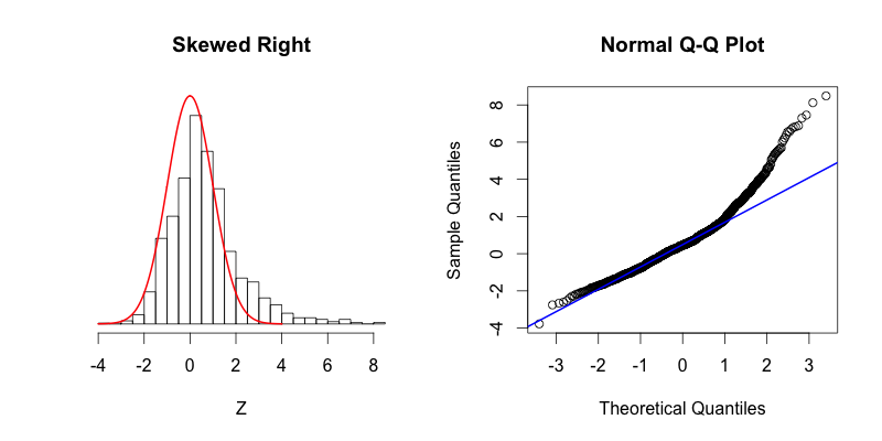
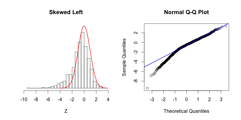
The second graph is “skewed right,” meaning that most of the data is distributed on the left side with a long “tail” of data extending out to the right. The third graph is “skewed left” with its tail moving out to the left. Looking at the Q-Q plot for the second graph you can see that the last two theoretical quantiles for this dataset should be around 3, when in fact those quantiles are greater than 8. The points depart upward from the straight blue line as you follow the quantiles from left to right. The blue line shows where the points would fall if the dataset were normally distributed. The point’s trend upward shows that the actual quantiles are much greater than the theoretical quantiles, meaning that there is a greater concentration of data beyond the right side of a Gaussian distribution. A similar phenomenon can be seen in the Q-Q plot of the third graph, where there is more data to the left of the Gaussian distribution. The points appear below the blue line because those quantiles occur at much lower values (between -9 and -4) compared to where those quantiles would be in a Gaussian distribution (between -4 and -2).
Plots 4 & 5:
The last two plots are symmetric, with their deviations from the Gaussian distribution occurring in both the left and right tails:
# Fat Tails
fat_tails <- c(gaussian_rv*2.5, gaussian_rv)

hist_(fat_tails, main = "Fat Tails", ylim = c(0, max(normal_density)), xlim = c(-10, 10))

qqnorm(fat_tails)
qqline(fat_tails, col = "blue", lwd = 2)

# Thin Tails
thin_tails <- rnorm(n, sd = .7)

hist_(thin_tails, main = "Thin Tails")

qqnorm(thin_tails)
qqline(thin_tails, col = "blue", lwd = 2)
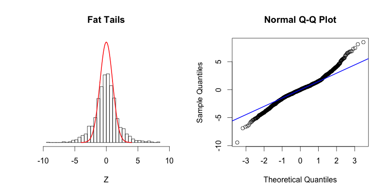
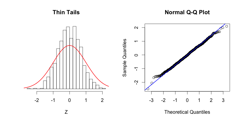
The fourth plot shows a dataset with “fat tails,” meaning that compared to the normal distribution there is more data located at the extremes of the distribution and less data in the center of the distribution. In terms of quantiles this means that the first quantile is much less than the first theoretical quantile and the last quantile is greater than the last theoretical quantile. This trend is reflected in the corresponding Q-Q plot. The fifth plot shows the contrasting phenomenon where there is more data concentrated in the center of the distribution and less data in the tails. These “thin tails” correspond to the first quantiles occurring at larger than expected values and the last quantiles occurring at less than expected values. Notice that the “thin tailed” Q-Q plot is a reflection of the “fat tailed” Q-Q plot across the X-Y diagonal.
Takeaways
From what I’ve been able to discern these are the keys to understanding a Q-Q plot at a glance:
- Remember that every data point is in its own quantile.
- If the points stray from linearity, the data is deviating from the theoretical distribution.
- Pay special attention to the axes, find quantiles that deviate, and then ask yourself whether those quantiles are greater or less than where they theoretically should be.
- Imagine where the histogram bar for the quantile of interest is relative to the theoretical distribution in order to get a sense of how the data are distributed.
I hope I’ve helped improve your understanding of Q-Q plots. If you find any interesting examples in the wild send them my way.
Update (2016-04-11)
@seankross @jtleek nice tutorial! It would also be cool to illustrate a bimodal distribution.
— Aaron McAdie (@allezaaron) March 1, 2016
Great idea! Here’s the code for creating and visualizing a bimodal distribution:
# Bimodal
bimodal <- c(rnorm(500, -1, .25), rnorm(500, 1, .25))

hist_(bimodal, main = "Bimodal", xlim = c(-2, 2))

qqnorm(bimodal)
qqline(bimodal, col = "blue", lwd = 2)
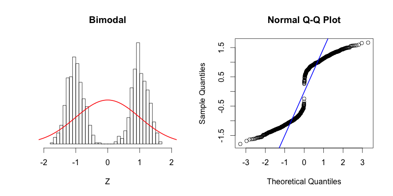
You can see that the tails of this distribution resemble the “thin tails” example. The first quantiles occur closer to zero compared to the first quantiles of a theoretical normal distribution. This trend continues until the points reach the y = x line around -0.6. Notice how the points cross the blue line of the Q-Q plot at the same point on the histogram where the red normal curve passes through the top of the histogram bar centered near -0.6. This point is a great illustration of what it means for the theoretical and the actual quantiles to be aligned. The points in Q-Q plot then cross below the blue line indicating that the actual quantiles that are close to zero are farther from zero than they should be theoretically. At the center of the theoretical distribution there are no data in the actual dataset, and therefore there is no point in the Q-Q plot at (0, 0). The upper half of the Q-Q plot is a reflection across X and Y of the bottom half. At first the data is farther from zero than it would be theoretically, and then the “thin tails” affect comes into play toward the right side of the histogram.
"Ah, a Q-Q plot. I'll go ahead and interpret it correctly on my first try," I said, my brow sweating profusely pic.twitter.com/WZfjsXoeBw
— David Robinson (@drob) April 11, 2016
May your brows be dry my friends.
Update (2016-04-12)
@hspter Can someone help me understand what's going on in @drob's one? It doesn't look like any of the examples @seankross has on page.
— Brandon Hurr (@bhive01) April 12, 2016
Below is my attempt at making a dataset that resembles the dataset in David’s tweet:
# @drob

batch1_seed <- c(550, 600, 650, 700, 750, 770, 800)

batch2_seed <- c(530, 550, 575, 600, 660, 725,800)

batch1 <- replicate(500, {
  seed <- sample(batch1_seed, 1)
  rnorm(1, mean = seed, 15)
})

batch2 <- replicate(500, {
  seed <- sample(batch2_seed, 1)
  rnorm(1, mean = seed, 15)
})

h1 <- hist(batch1, breaks = 30)
h2 <- hist(batch2, breaks = 30)

plot(h1, col = rgb(0, 0, 1, .25), xlim = c(450, 850),
     ylim = c(0, 40), xlab = "Random Variable",
     main = "@drob", ylab = "", yaxt = "n")
plot(h2, col = rgb(1, 0, 0, .25), xlim=c(0, 10), add=T,
     ylab = "",  yaxt='n')

par(xpd = TRUE)
legend(350, 40, c("Batch 1", "Batch 2"), bty = "n",
       pch = 15, col = c(rgb(0, 0, 1, .25), rgb(1, 0, 0, .25)))
par(xpd = FALSE)

qqplot(batch2, batch1, xlim = c(300, 900),
       ylim = c(300, 900), xlab = "Batch 2",
       ylab = "Batch 1", main = "Q-Q Plot")
abline(a = 0, b = 1, col = "blue", lwd = 2)
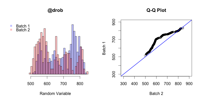
The first thing to keep in mind is that in this instance the Q-Q plot is comparing the quantiles of two different samples, unlike in all of the previous examples in this post where sample quantiles are being compared to theoretical quantiles. The general trend of this Q-Q plot shows is that the quantiles of batch 2 generally occur before the quantiles of batch 1. The first and last quantiles of both batches match up, but the closer a quantile from batch 2 is to the “middle” (the median of both batches combined) the earlier that quantile will occur in batch 2 compared to batch 1.