On August 3rd I gave the following talk at the 2017 Joint Statistical Meetings as part of a session titled “Creating Interactive Graphics” organized by Peter Hickey and John Muschelli. The talk was followed by a panel discussion with fellow speakers Carson Sievert and Leo Collado-Torres. You can find the slides for this talk here. During this talk I discussed an R package I’m currently working on called p5 which you can check out on GitHub.
When we think about statistical graphics we most often think about graphs that visualize one, two, or three dimensions like a box plot or a scatter plot. Those kinds of graphs help us visualize trends, model fits, and residuals which are all valuable insights for statisticians. Lately I've become interested in visualizations beyond the traditional X-Y plane, which I hope can allows us to communicate new kinds of insights interactively.
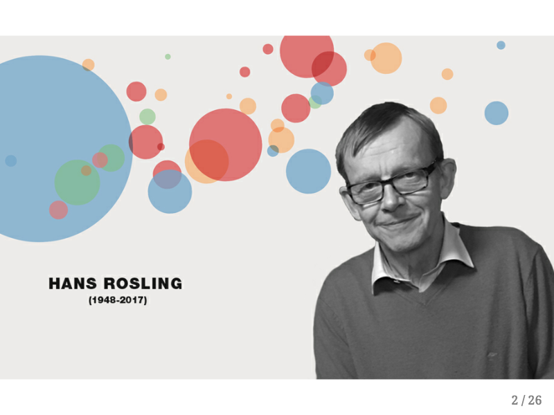
In the past year the public health community has lost a few of its legends including Hans Rosling, the founder of Gapminder. Gapminder does incredible work promoting data about human development and enabling the public to have a better understanding of global public health problems.
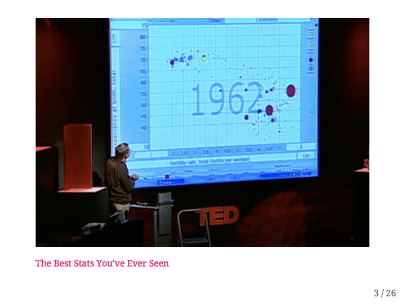
In general I'm not a fan of Ted talks, but Hans Rosling's talk The Best Stats You've Ever Seen is must-see because of his signature presentation style and his use of interactive graphics. When he gave this talk in 2006 there were virtually no off-the-shelf interactive graphics packages so Gapminder built their own, which Dr. Rosling uses during his talk to the amazement of the audience. I've been thinking about this talk and about how it conveys intuition in three dimensions. Seeing countries rise and fall along human development parameters across time allows the audience to think of each country as an independent agent in a system. As the system evolves Dr. Rosling walks the audience through how policy changes that were made in each country effect their movement in the system and the resulting societal improvements.
As statisticians we're often interested in studying systems - so we create models that approximate the parameters of a system based on individual outcomes. However conveying what it is that our models are trying to say is often difficult. When I look at a table of coefficients from a linear model it often takes me a few minutes to understand the relationships between terms and their interactions.
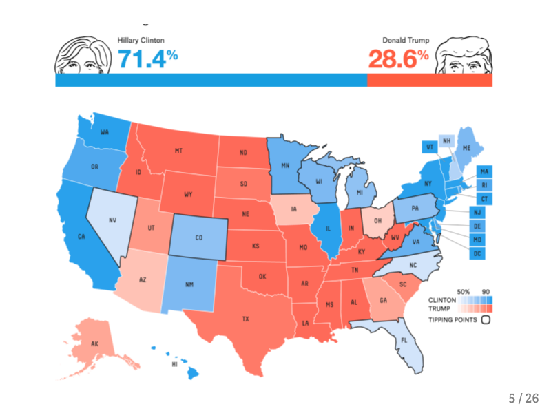
I'm sure you can relate to my experience during the recent Presidential election when some of my friends asked me my opinion about certain electoral prediction models. This graphic shows the outcome of thousands of simulations run under FiveThirtyEight's model a few days before the election. I tried to explain what it means for a model to give a candidate a ~25% chance of winning, but I still felt that the intuition behind these predictive models wasn't being conveyed by their creators. After the election there was considerable outrage by the public which is summed up pretty well by the following tweet.
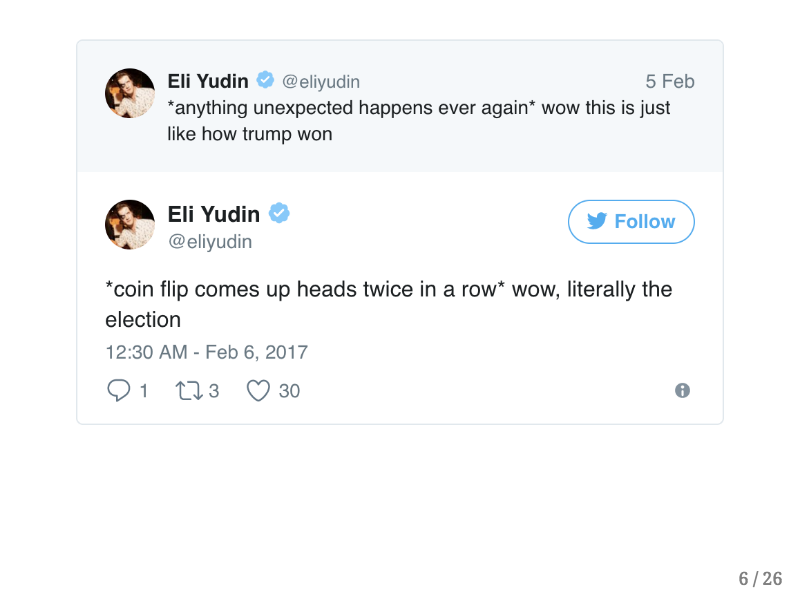
Anybody who flipped a coin twice would not consider the occurence of two heads in a row to be a miracle, and yet there is a widespread belief that groups like FiveThrityEight who took into account a fair amount of uncertainty in their model “got the election wrong.”
Now I'd like to share with you some work that I really admire, work which I believe conveys an intuition through the user's ability to interact with the systems being examined.
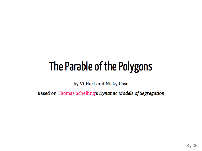
The Parable of the Polygons was created by Vi Hart and Nicky Case in order to demonstrate how small individual biases can have large societal consequences in terms of segregation. This project is based on the work of Thomas Schelling's Dynamic Models of Segregation.
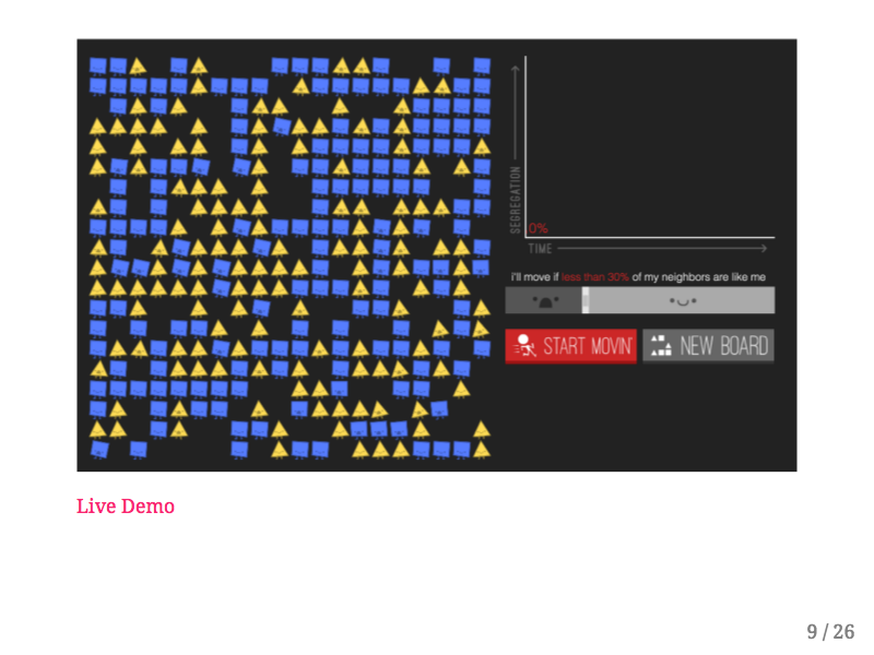
I'm just going to do a quick demo but I really encourage you to go play with this application yourself. In this model there are two kinds of people, blue squares and yellow triangles. As you can see some of these shapes are rocking back and forth with their mouths open - clearly uncomfortable, while other shapes are happy and sitting still. The unhappy shapes won't be happy unless they're surrounded by a certain percentage of shapes that are like them. You can click and drag each shape individually to make it more happy, or you can click the “Start Movin'” button and the unhappy shapes will randomly move until they find a happy position. Over time you can see that this environment becomes drastically more segregated, and if you increase the bias the arrangement of the shapes becomes even more segregated. I believe this kind of demonstration, where users can adjust model parameters and witness resulting behavior conveys an intuition about this sociological model that isn't expressed by showing the relationship between bias and segregation alone.
Let's look at another example of these types of interactive models, this one also created by Nicky Case.
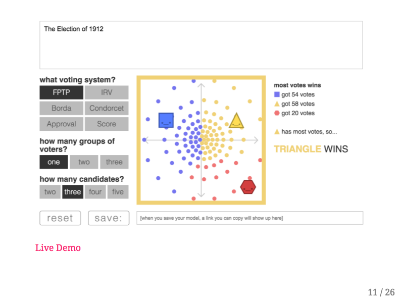
Once again I strongly encourage you to play with this on your own. This interactive model explores different kinds of voting procedures, most of which have been developed by political scientists without being put into practice. In this situation I've set up a reenactment of the US election of 1912. Each little circle in the in the big square on the screen represents one voter, and with the First Past the Post electoral rules each dot will vote for the shape that is closest to it. Now if you remember your history books you'll recall that in 1912 Woodrow Wilson (the blue square) was the Democratic challenger to the incumbent Republican William Howard Taft (the yellow triangle). However Theodore Roosevelt, a former President and third party candidate entered the race with a political platform that was close to Taft's. If I drag Theodore-red-hexagon-Roosevelt slightly up and to the left, you can see that it creates a “spoiler effect” allowing the blue square (Wilson) to win the election! However if I leave Teddy where he is and simply change the voting system to “Score” you can see that the yellow triangle wins the election instead of the blue square. Users can therefore experiment with different kinds of voter preferences, numbers of candidates, and voting systems to see how a democratic process is effected.
The two previous interactive models are very engaging and they were enabled by individuals who have years of art and design experience on top of deep and dangerous Javascript knowledge. I don't believe it's reasonable to teach every data scientist to have this level of Javascript fluency, so I was thinking about how existing technologies could be adapted with current data science thinking to produce interactive models in this style. It also would be nice to be able to introduce web technologies and Javascript within the familiarity of a data scientist's pipeline.

For a while I've admired the p5.js project by Lauren McCarthy which she developed while at NYU ITP. The p5 library turns your web browser into a sketchbook, where certain p5 functions create lines, circles, squares, and other shapes on a webapge.
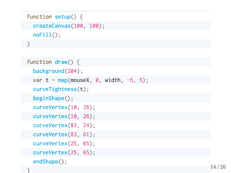
I was looking through the p5 documentation and there are many examples that look like this page, where first you set up the drawing environment in the setup function, and then you specify what will be drawn in the draw function. This code sketches out a complicated curve, and each curveVertex function call specifies an inflection point in the curve. After seeing several code examples like this I started to realize…
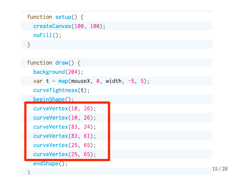
…these arguments look like a data frame! The first and second arguments are just the positions of each vertex on the canvas, but you could imagine binding other rectangular data to functions in p5.
Then I started thinking: what if you could combine the data wrangling and rectangling power of R with the creative expressiveness of p5? In order to test this idea I started building the p5 library for R, an htmlwidget in the style of leaflet or plotly. Let's go through a few demos now about what you can do with p5 for R.

All of the following are live examples, meaning that they were rendered within this R Markdown presentation. Here's a very simple example where first we'll load the p5 library, then to start this sketch we'll use the p5() function, which acts much like the leaflet() function. The createCanvas() function creates a drawing canvas that is 100 by 100 pixels wide, and then the background() function fills the canvas in with Hopkins blue. The rect() function draws a white rectangle starting at the x and y coordinates of 10 with a height and width of 50 pixels. Similarly to other R packages built with htmlwidgets each function takes the full p5 sketch as the first argument so that the pipe operator can be used.
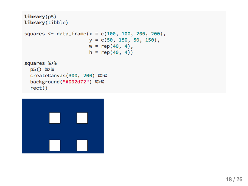
In this second example we'll first create a data frame with values for the position, width, and height of each square. Then we can pipe the data frame into almost the same code as we had before, except this time the rect() function knows to find the upstream data frame and to draw a rectangle for each row.

You can also specify more complicated shapes and lines with p5. In this example I'm using some constants that come with the p5.js library which you can access with the formula operator from R.
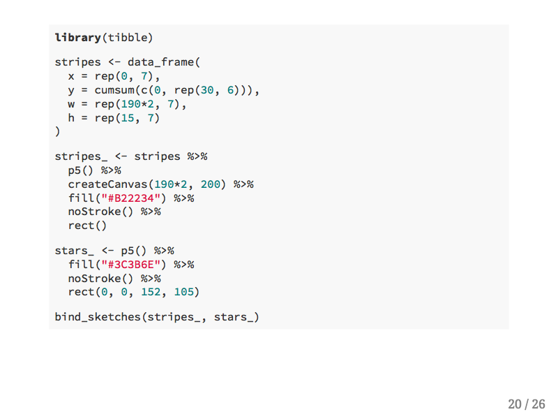
Since p5 allows you to draw using data frames you can use the bind_sketches() function to combine multiple drawings. In this example 13 rectangles are specified with a data frame, and then they're combined with one rectangle.

The resulting image is the beginning of drawing an American flag.
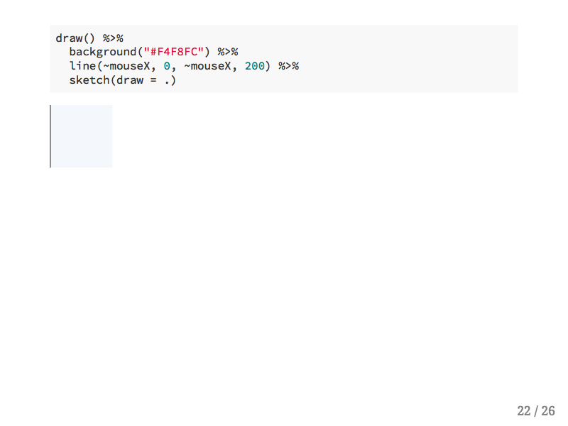
Since this is a lecture about interactive graphics, let's talk about interactivity with p5! With p5's mouseX constant we can draw a line that appears wherever the mouse is hovering.
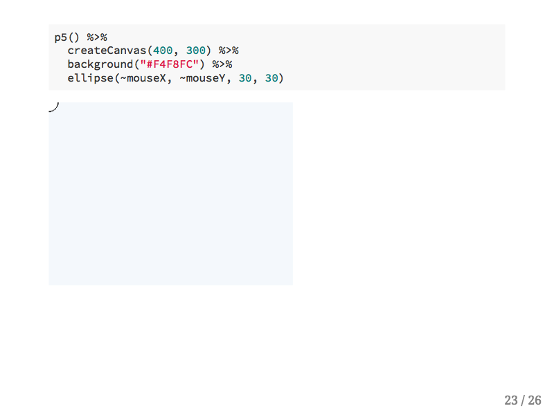
We can also draw circles, and we can track the x and y position of the mouse.
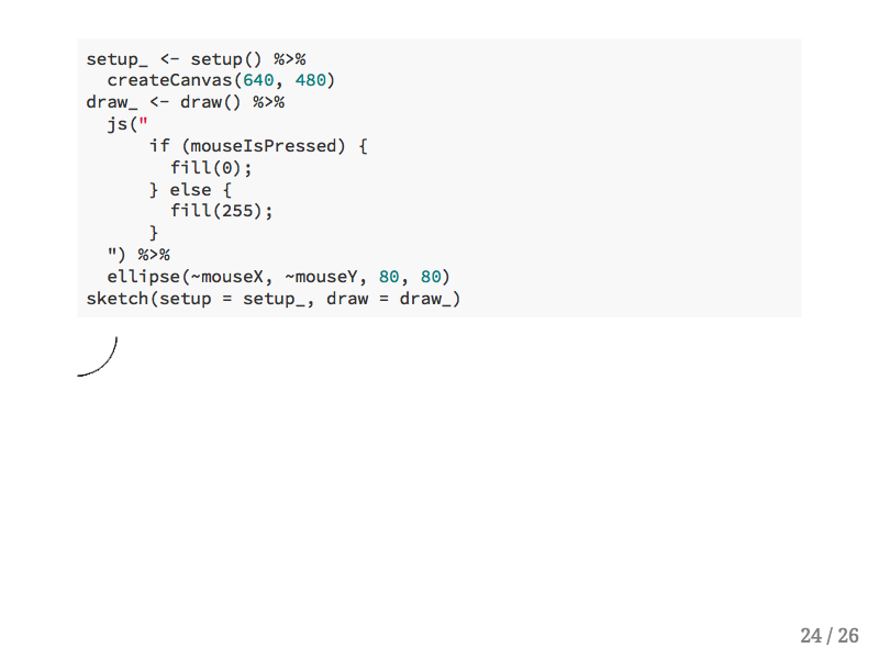
If you want to add Javascript code directly to a sketch you can do so with the js() function. This allows users who want to experiment with Javascript to use it while still in the R environment. This if statment turns the brush on this canvas to black.
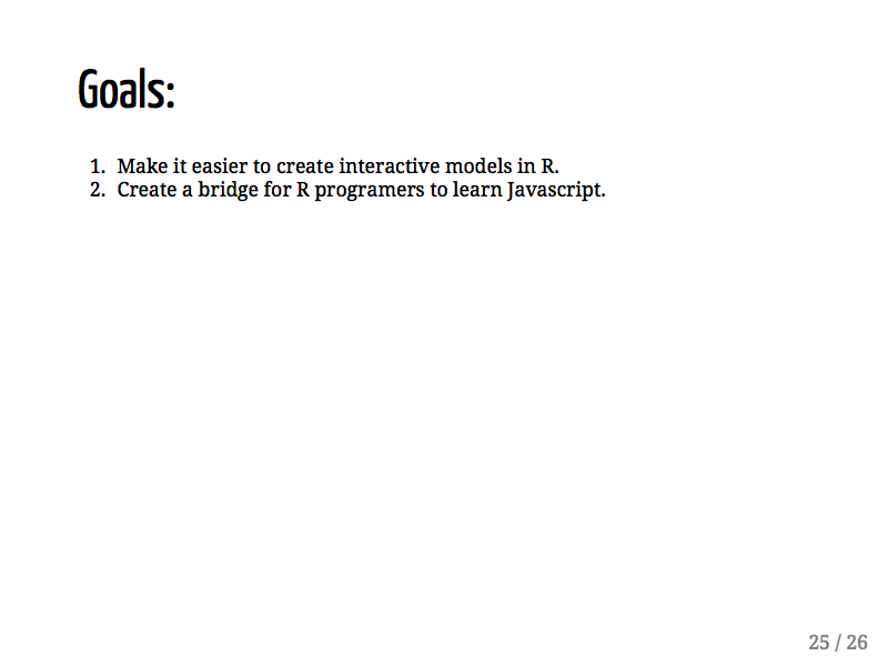
This project is still a work in progress, but my hope is that bringing p5 into R will at least expose more people to the basics of Javascript, though one day it could even enable folks to create their own interactive models.
👋